Project Description
OK! Magazine: Website Redesign
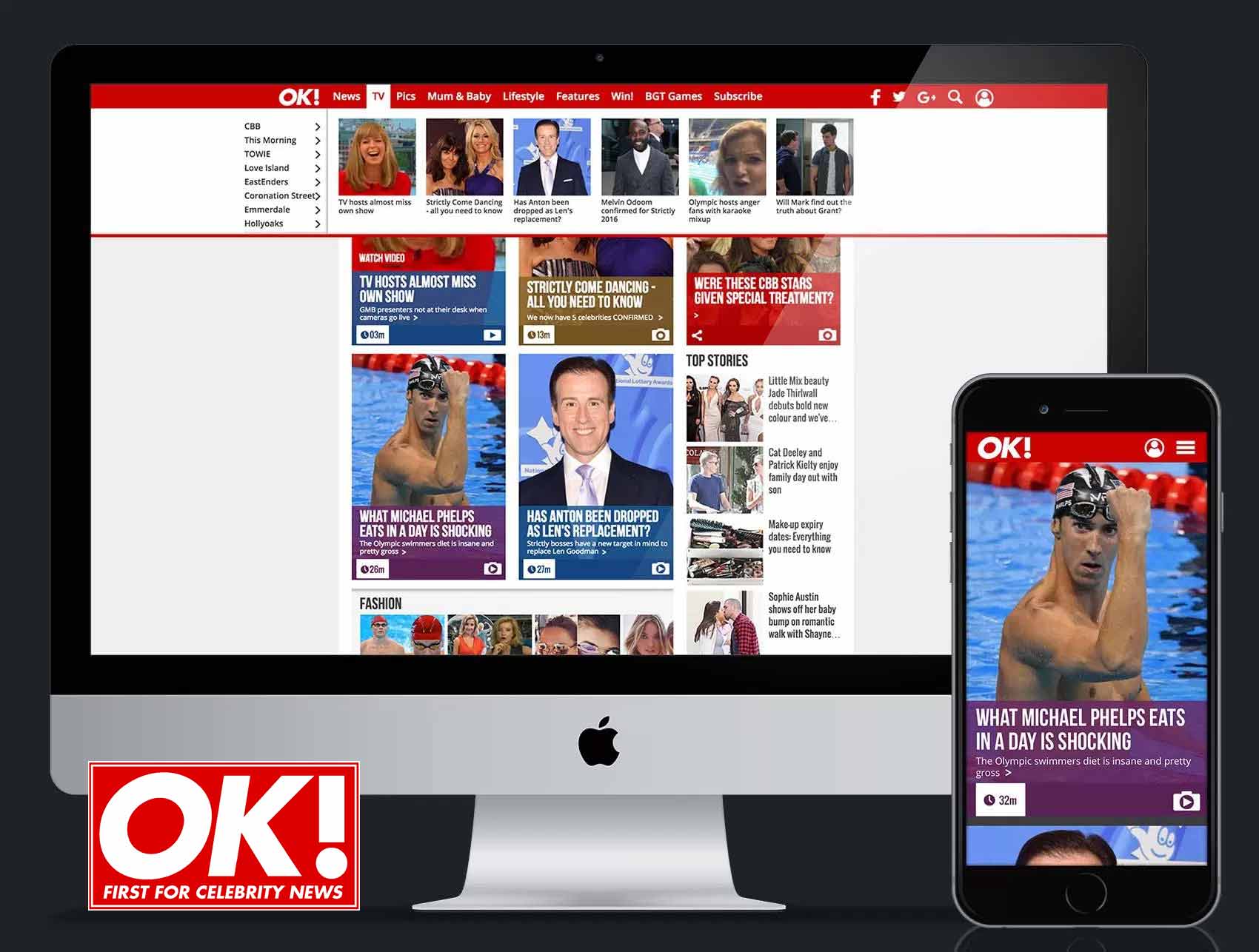
At Northern & Shell one of my biggest projects was to redesign OK! Magazine website. The brief was to create a truly mobile-first experience. OK! magazine is a picture-led brand with a high turnaround of content, therefore, pictures were to feature heavily within the site. Leading the design team using an Agile approach, I created the user flow, wireframed the site and created the UI. As a result of the redesign, traffic to the website increased by more than 300% in the first year and continued to grow year on year. For phase 2 of the redesign I was tasked with investigating and improving the site’s navigation. Allowing for more content ‘above the fold’ I redesigned a new type of navigation which was to make the main menu into a visual dropdown using thumbnail images. Integrating Google Analytics to show live and daily trending stories.